
Week 22: Football KITT – My Dirty Dozen
 Boris Johnson was described last week as being a bit like David Hasselhoff without his talking car, if his most trusted aide and advisor, Dominic Cummings had been ousted for breaching coronavirus rules by making at least one 520-mile round journey plus a sight-seeing – sorry, eye-testing – trip.
In other words, less effective. A little bit rubbish even. And that makes Cummings the talking car. Bit ironic. The real talking car was, for anyone under forty, named KITT, and Hasselhoff and KITT were the duo that made up the TV series, Knight Rider, that started life in 1982 and went onto have four series on screen as well as three films, video games, other merchandise and a convention in its honour. For the uninitiated, Hasselhoff played Michael Knight (see what they did there?), a crime-fighter who relied on the technologically brilliant automobile – a modified 1982 Pontiac Trans Am – whose full title was Knight Industries Two Thousand, virtually indestructible (so a lot like Cummings) and highly self-aware (not at all like Cummings), to take on ruthless criminal organisations.
The original series (90 episodes) was loved by audiences and although it was no classic, it became a cult favourite that gave a major career break to the young (and the restless) Hasselhoff who went onto even more fame in Baywatch. However, the actor believes that Knight Rider was a phenomenon and ‘much better than Baywatch’ and he has a point as almost 40 years later, it continues to be shown around the world. Although so does Baywatch.
KITT also enjoyed a long career. After Hasselhoff’s departure to chase Pamela Anderson up and down the Californian beach, future incarnations airbrushed out the main man (now severely rich after buying up the rights to Baywatch when the first season wasn’t well received and taking it on an 11-year successful stretch) until he returned for a less productive second spell with KITT in 1991.
So, as we’re at that time of year where signing new players, the forthcoming fixture list and the most eagerly awaited of all – the kit for next season – is usually at the forefront of our minds, I decided to take my own trip down memory lane.
At this time, pages and pages of websites are normally devoted to either new kit launches or leaked images (usually in some Far East fitting room) of the latest designs. There’s still some action out there, but nowhere near the amount you’d normally expect to see; in the UK at least, although launches in the US, China, Brazil and Scotland have kept the websites busier than they’d probably expect to be.
So what are the ones that fall into memorable KITT territory? Here’s my dirty dozen…
Phenomenal
1.Brazil, 1970 – the winner of a recent BBC poll, you could be forgiven for thinking that Brazil’s iconic yellow with round green collar had barely changed in, like, forever. But it wasn’t even their first choice colour until the 1950s. Favouring all-white, they scrapped it after losing the final game of the 1950 World Cup to Uruguay and with it the trophy on home soil. But rather than just tears – as we saw in 2014 when Germany humiliated them – they also showed initiative and commissioned a competition, that was won by a schoolboy, to design a new strip that has been worn in five World Cup triumphs and never better so than in the heat of the Azteca in 1970.
2.Denmark 1986 – last year, 442 magazine ranked this beauty at the top of the pile. The original Hummel design came in all red, with one half of the shirt made up of thin red and white stripes that looked pink on the non-HD TV screens of 1986 when they wore it at the World Cup, also in Mexico. Arguably the best team in the world at the time, and with definitely the best kit although it wasn’t liked that much by the Danes when they first saw it, and in the tournament itself they wore a different variation (white/red, red/red, red/white and white/white) for each of their four games before Spain eliminated them; only wearing the classic all red ensemble in their 6-1 demolition of Uruguay, which is still one of the best displays by a team that I’ve ever seen.

3.Netherlands, 1974 – The Dutch had already somehow made Orange really cool. Johan Cruyff managed to make it even cooler by tearing a stripe off his Adidas-branded kit so that it didn’t compromise his sponsorship deal with rivals, Puma. Variations of the simple and elegant design saw action in two consecutive World Cup Finals but both were lost to the host nation despite the Dutch having much more swagger about them, and making them the best team not to win the competition. I also wish I’d known about Cruyff’s intervention when the kids at school called some of my sport’s gear ‘Adidas Two-Stripe’!
4.Sampdoria, 1991/2 – In many regards, they’d be described as unfashionable amongst the giants from Turin, Milan and Rome but the team were anything but with a kit that finds its way into most ‘best kit’ polls and for good reason.
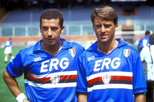
Samdoria kit of the early 90s
A striking blue always goes down well in Italy but the unusual white, black and red mid-chest band that shouldn’t really work but does, as well as the Italian national badge on the chest (their own was in the band), made it iconic and worth repeating many times over the years. It was clearly elegant as they got the likes of Gullit, Manchini, Vialli, Cerezo, Eder, Klinsmann and, of course, Danny Dichio to wear it.
Not Classics But Loved By Fans
1.England, 1982 – A footy.com review recently awarded England’s kit that was worn at the 1982 World Cup in Spain the title of best ever. I’d not go that far, but the decidedly shiny Admiral effort was the first England kit I ever owned so it does have a place in my heart. After years of relatively plain and inoffensive shirts, this was a revelation with a shoulder panel in red, white and blue that looked more Union Jack than St Georges Cross. Lightweight versions had to be shipped from Admiral’s Leicester site to the team in Spain, with some very impromptu badge stitching to make the deadline; hence them being literally all over the place on some of the shirts.
2.Italy, 1982 – my personal favourite shirt. While falling in love with the game completely during my first World Cup (that I can remember anyway), I fell even more in love with Italy and Paulo Rossi. Maybe the underdog element helped as they initially bored and frustrated in equal measure through their opening group (only knocking out Cameroon on goals scored after three draws) then somehow putting out the holders (Argentina) and then the favourites (Brazil) in their next two games before beating Poland and West Germany with relative ease in the final stages. Rossi had returned from a match-fixing ban, went goalless in the group then scored six in the last three stages. I wanted nothing more than the Azzurri blue shirt (by Le Coq although their officially worn kit at that time never bore the logo) with a big number 20 on the back. It was my pride and joy when it arrived on Christmas Day and I duly wore it for a kickaround in about three foot of snow.
3.West Ham United, 2019/20 – nostalgia is a sure-fire winner when it comes to footy kits and this one is chosen because it embodies everything that’s good when the designers get it right. It’s a faithful recreation of the 1980 FA Cup winning kit, without trying to be clever and add new touches.
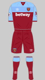
Kit courtesy of historicalkits.co.uk
I’m no Hammer but it was the first cup final that I was old enough to remember and the crisp all white kit stood out in a match where chances were few and far between and a second division team won the cup; which hasn’t happened since. Talking of which, both Arsenal and West Ham wore change kits in this match which was a popular occurrence in the post-war years (it happened in 1947, 1948, 1950, 1956, 1957 and 1968) but only happened again once since then (in 1982).
4.Walsall, 1987/8 – you have to include one of your own and this is mine. Many Saddlers’ fans, me included, have always had a thing about white shirts and red shorts. They were the only league club with that kit in the Subbuteo range (it shared it with Poland) when I was growing up, but I was too young to have seen it in person until it was reintroduced in 1986. For three years, white was the primary colour but the one I preferred was an ‘own-brand’ all-white version that was worn during the promotion season (who doesn’t love a kit that is linked to a major success) and was incredibly simple.
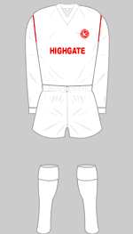
Kit courtesy of historicalkits.co.uk
No frills, no pin or shadow stripes, not even a contrasting collar – its beauty was in its sheer plainness. And Real Madrid and Leeds, plus England at least once in 1966, didn’t have a problem with that either.
Not As Productive
1.Coventry (Away) 1978/9 – Admiral, again, were causing something of a stir in the football kit world with their eye-catching and different designs. Initially given permission to redesign the Leeds away kit, they became progressively braver including a design that Wales and Coventry adopted in the late 70s. Wales, with a red, green and yellow combination got away with it and the Sky Blues would have done too if it wasn’t for the fact they chose brown as their away colour. It was bad enough already, but when paired with Ian Wallace’s ginger permed hair, it was less eye-catching and more eye-watering.
2.Manchester United, 2018/19 – every now and again, the manufacturers and their designers take away the very thing that makes a great kit great. With this one it was white shorts. The uniqueness that makes a Manchester United kit look so intimidating (or did) was the way the white broke up the red and black and had done since the early 1900s with only one or two breaks from tradition.
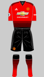
Kit courtesy of historicalkits.co.uk
But this was the only time they had donned black shorts as their first choice set in their entire history and it looked wrong. And that was before we get onto the lines on the shirt that makes it look like the shorts were chosen by Simon Cowell. But then, that looks shit on any shirt.
3.Hull City, 1993/94 – it’s tempting to say all 1990s kits period. It was a horrendous era for football fans with the introduction of new dyeing techniques and some OTT imagination proving a lethal cocktail. But kit designers love nothing more than recycling and some kits are much better second time around.
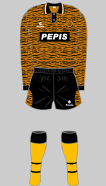
Kit courtesy of historicalkits.co.uk
Hull have done some nice things with the tiger stripes in recent years but their first stab at it was not nice at all, some might say it was almost criminal. They went one worse two years later (check out the socks that didn’t match) but this ghastly beast started it; they looked less like football players and more like Bet Lynch before she’d had her hair done. Norwich also admirably recreated the infamous ‘egg & cress’ kit from the same period to much greater effect.
4.Newcastle United (Away), 2009/10 – stripes can be amazing (Juventus) but also a disaster in the wrong hands (Brighton’s shorts or the West Brom carrier bag, to name two). But stripes of the same colour? That doesn’t sound like it’s even really stripes but Newcastle wore just that design as a change kit in the Championship at the turn of the decade. Worse, the colour was yellow so the kit was labelled a two-tone banana (to give one of the printable ones) by rival fans although it wasn’t loved much by ‘Toon fans either. But at least they are prepared to call it yellow, not like Wolves who wore the same colour shirts last season and still tried passing it off as ‘old gold’.
words Darren Young, D3D4 columnist